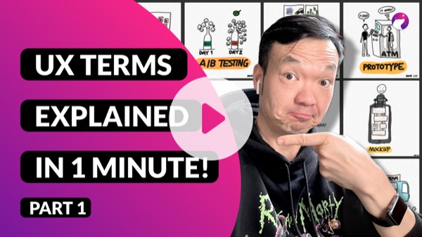
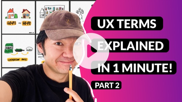
Why I create those stuff?
As a self-taught UX/Product designer, I know how hard it is to learn UX from scratch. The primary blocker for almost every learner is the terminologies. There are SO many terminologies to get familiar with, and it's really overwhelming.
When I help other people on their design journey as a design mentor, I see people struggling with this challenge. Some of them succeeded, some failed. I found that the more likely successful way to overcome this challenge is not about getting a precise understanding of each terminology.
The best way to get over this "terminology crisis" is to get a rough understanding of a new concept and explain it in your own language (if you can have an analogy related to that concept, that would be better) and move on. I call it a layering approach. We will have different understanding layers of the same concept, as our holistic experience in the domain is growing and changing.
That's why I created these 1-minute explanations. Hope you will find them helpful for learning UX/product design.
Note:
I did those explanation videos as a monthly challenge. If you want to be updated when I create something similar later, you can subscribe to my newsletters below - I promise I will never send spam :)
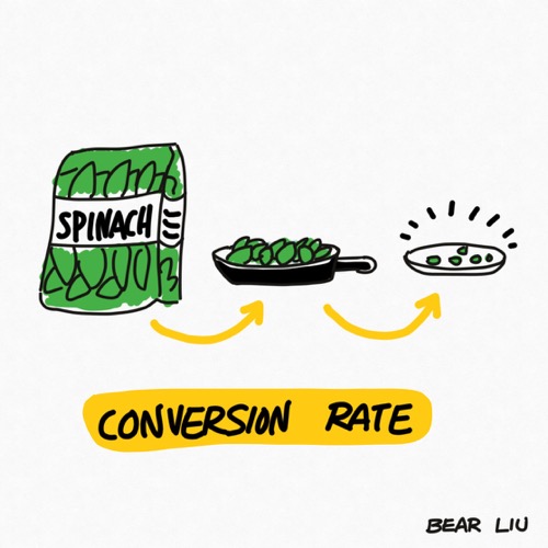
Conversion rate
Imagine you buy a bunch of spinach for dinner. When you cook, the size of the spinach will shrink from a basketball to a table tennis ball. The percentage of final size out of the original size is your conversion rate.
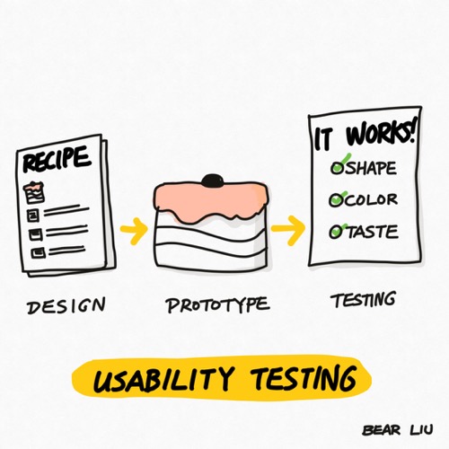
Usability testing
In UX design, usability testing asks users to complete tasks while a researcher observes them to learn if any problems or confusion are encountered when interacting with the design. It's an essential job for UX designers.
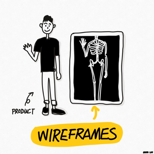
Wireframe
Wireframing is a way to design a website or app at the structural level. It shows an overview of the basic stuff, such as structure, layout, information architecture, user flow, functionality, and intended behaviours. Usually, wireframes contain a minimum level of colour, styling, graphics etc.
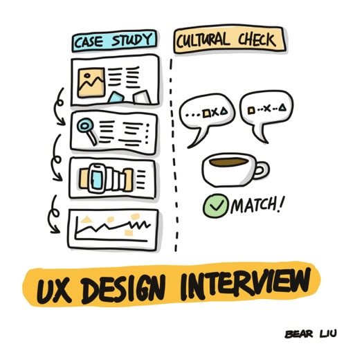
Design interview process
The UX designer interview process depends on companies, markets and industries, and it could have different steps, formats and timeframes. But there're two things usually included: a case study review and a culture check.
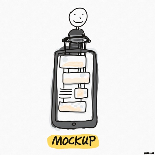
Mockup
A mockup is a realistic representation of how the design will finally look. Usually, a mockup should look exactly like the final product.
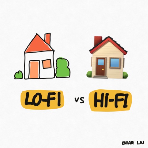
Lo-fi vs Hi-Fi
Fidelity refers to the level of detail on a wireframe or prototype. There are low, medium, and high fidelity prototypes. The type you use depends on the needs of a given project.
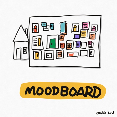
Moodboard
A mood board is a collection of stuff such as images, text, colours or other branding elements that help define the style of a product.
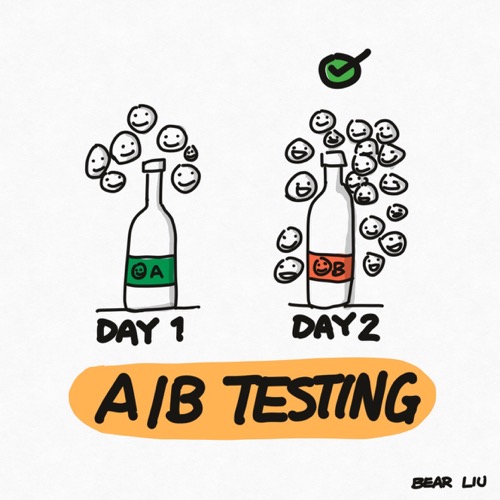
A/B testing
A/B testing compares two designs against each other to determine which performs better.
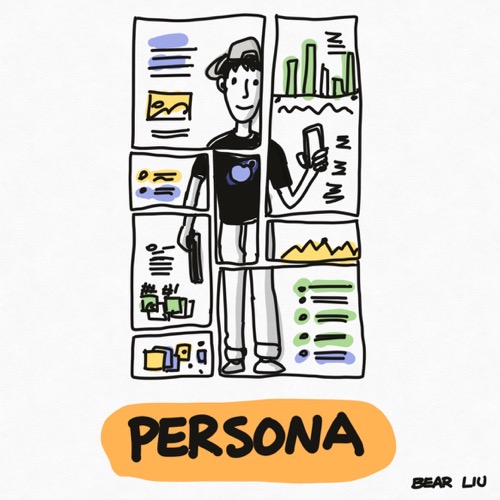
Persona
A persona is a fictional representation of a user group you're designing for to help you make design decisions.
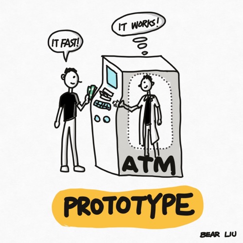
Prototype
A prototype is an outline of the proposed final product used for testing before launch.
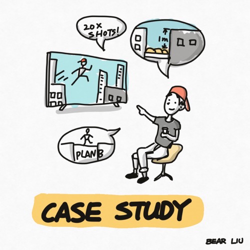
Case Study
In terms of UX design, a case study is a detailed story of how you solve user experience problems.
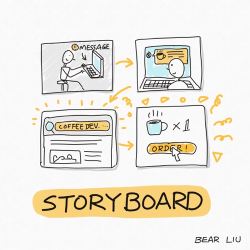
Storyboard
A storyboard communicates a story through images to provide additional context to your team, and it helps the designer clarify the user journey and persona.
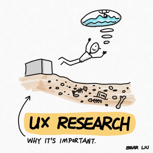
UX Research
UX research is about collecting user and customer insights to make better business decisions.
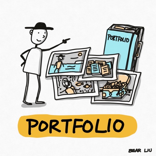
Portfolio
UX portfolio shows your skills and experience in solving a real problem, and it's essential for a UX designer's career.
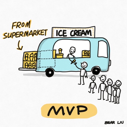
MVP
An MVP(minimum viable product), is a product with just enough features to attract early-adopter customers and validate a product idea early in the product development cycle.
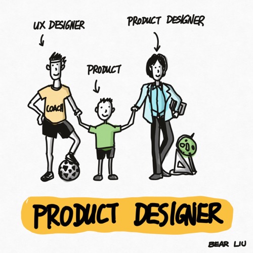
Product designer
A product designer uses the different facets and tools of design to create and execute a solution that solves a user’s experience problem. At its core, a product designer is a problem solver.
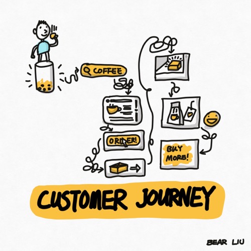
Customer journey
A customer journey map is a visual representation of how a customer interacts with and experiences your business when trying to achieve a goal.
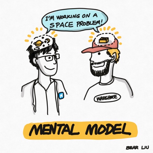
Mental model
A mental model explains someone's thought process about how something works in the real world.
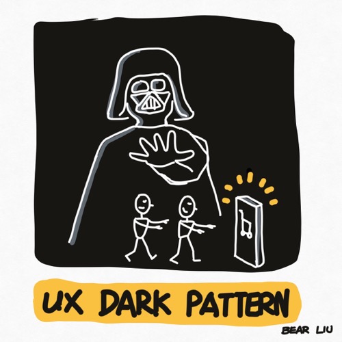
Dark pattern
A dark pattern is a deceptive user experience that takes advantage of the way people habitually use websites and apps in order to get users to do something they didn’t intend to.
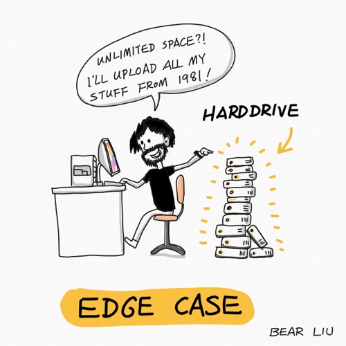
Edge case
An edge case is a problem or situation that occurs only at an extreme operating parameter.
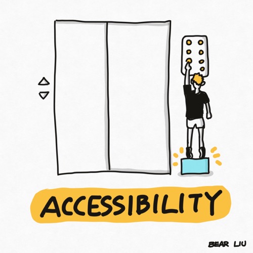
Accessibility
Accessibility is the concept of whether a product or service can be used by everyone—however they encounter it.
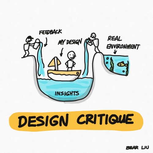
Design critique
A design critique is a design team activity in which for presenter shares the design, and the critiquer offers informed thoughts or perspectives.
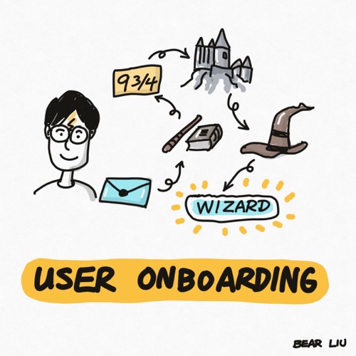
User onboarding
User onboarding encompasses the initial experience in the application, online or offline training, goal-setting, and the organisation’s customer success process—a big part of a UX designer's job.
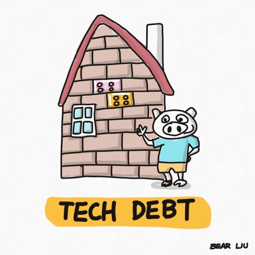
Tech debt
In software development, technical debt or design debt is the implied cost of additional rework caused by choosing an easy (limited) solution now instead of using a better approach that would take longer.
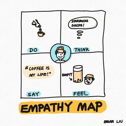
Empathy map
An empathy map is a collaborative visualisation used to articulate what we know about a particular type of user.
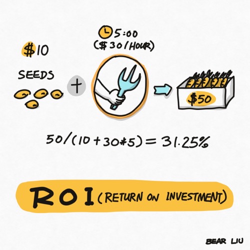
ROI
ROI, or Return on investment, is a metric used to understand the profitability of an investment.
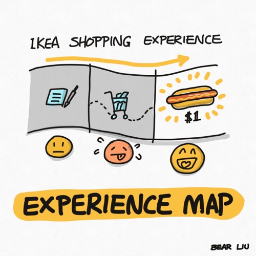
Experience map
An experience map is a visualisation of an entire end-to-end experience that a “generic” person goes through to accomplish a goal.
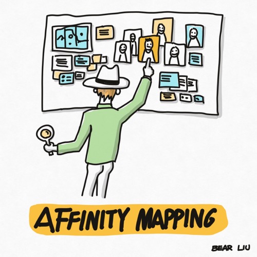
Affinity mapping
Affinity mapping refers to organising related facts into distinct clusters.
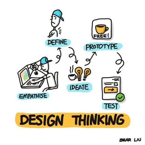
Design thinking
Design thinking is an iterative process for creative problem-solving. In this process, you seek to understand your users, challenge assumptions, redefine problems and create innovative solutions which you can prototype and test.
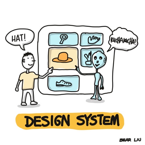
Design system
A Design System is the single source of truth that groups all the elements that will allow the teams to design, realise and develop a product.

